How-to use the Music Mastering UIKit for React
Getting started with the Music Mastering UIKit for React
The Dolby.io Music Mastering UIKit for React is designed to help React developers reduce the complexity of building and embedding a Dolby.io Music Mastering solution for the web.
The package consists of the following element:
- UI components: Basic elements used to create a Music Mastering solution for the web.
Music Mastering Kickstart App
For an example of an application created using this UIKit, see the Music Mastering Kickstart App.
Prerequisites
- React 16.5 or greater.
- A supported browser: Chrome 100+, Safari 15+, Firefox 100+, or Edge 100+
Setup
# Create a new React application
npx create-react-app my-app

# Change into the app directory
cd my-app

# Install the UI kit with yarn
yarn add @dolbyio/media-uikit-react

# Start the dev server
npm start
Use a component
The following examples include a sample of the components available in the UIKit.
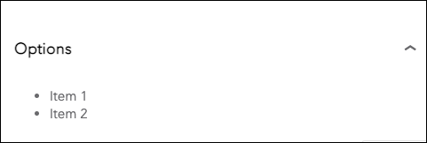
Accordion
The Accordion component allows the user to show and hide sections of related content on a page.
import { Accordion } from '@dolbyio/media-uikit-react';

const MyComponent = (props) => {
  return (
    <div>
      <Accordion expanded heading={<h3>Options</h3>}>
        <ul>
          <li>Item 1</li>
          <li>Item 2</li>
        </ul>
      </Accordion>
    </div>
  );
};
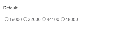
RadioGroup
The RadioGroup component allows users to make one selection out of a list of options and only number types are supported.
import { RadioGroup } from '@dolbyio/media-uikit-react';

const MyComponent = (props) => {
  return (
    <div>
      <RadioGroup
        defaultValue={3200}
        name="Default"
        onChangeValue={function noRefCheck() {}}
        values={[16000, 32000, 44100, 48000]}
      />
    </div>
  );
};
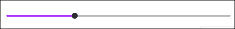
Slider
The Slider component allows the user to set values on a continuous scale.
import { Slider } from '@dolbyio/media-uikit-react';

const MyComponent = (props) => {
  return (
    <div>
      <Slider defaultValue={30} max={100} min={0} onChange={function noRefCheck() {}} />
    </div>
  );
};
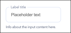
TextField
The TextField component allows users to enter and edit text.
import { TextField } from '@dolbyio/media-uikit-react';

const MyComponent = (props) => {
  return (
    <div>
      <TextField
        caption="Info about the input content here."
        label="Label title"
        onChange={function noRefCheck() {}}
        placeholder="Placeholder text"
        value=""
      />
    </div>
  );
};
Waveform
The Waveform component allows users to display a waveform of an audio track, choose a segment of the track for preview, select location of the playhead, adjust volume, and interact with transport controls and audio timeline bar.
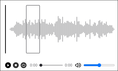
import { Waveform } from '@dolbyio/media-uikit-react';

const MyComponent = (props) => {
  return (
    <div>
      <Waveform previewActive url="/media/my-track.wav" />
    </div>
  );
};
AudioConfigurator
The AudioConfigurator component provides controls for selecting audio characteristics such as sample rate, channel count, and sample size.
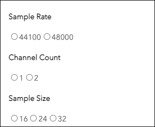
import { AudioConfigurator } from '@dolbyio/media-uikit-react';

const MyComponent = (props) => {
  return (
    <div>
      <AudioConfigurator
        channelCounts={[1, 2]}
        defaultChannelCount={1}
        defaultSampleRate={44100}
        defaultSampleSize={16}
        onChangeChannelCount={function noRefCheck() {}}
        onChangeSampleRate={function noRefCheck() {}}
        onChangeSampleSize={function noRefCheck() {}}
        sampleRates={[44100, 48000]}
        sampleSizes={[16, 24, 32]}
      />
    </div>
  );
};
Updated 6 months ago